UserVoice: listening to learners every Monday
1 in 3 pieces of feedback is about the content.
An EdTech platform receives thousands of pieces of learner feedback a year, spread across four sources and never read together.
I brought them together in a single table. AI classifies each piece of feedback with a confidence score and leaves the doubtful cases to a person. The summary takes five minutes to read, every Monday.
We thought it was mostly bugs. The data pointed to the content, and the effort moved to its quality.
The starting point
Feedback comes from four sources: the NPS survey, the placement test, the end of each course, and an open feedback form available on every page of the site.
When I launched UserVoice in September 2026, this feedback was not tagged. Each piece stayed in its own source, and the same topics kept coming back without anyone knowing whether they had already been handled.
The unspoken assumption was that our problems were mostly bugs.
Listening every Monday
I started from a question I wanted to be able to answer every Monday, in five minutes. Which topics come up most? Are they being handled? Has a new topic appeared without anyone noticing?
Answering it meant reading the four sources together. I brought them into a single table. Each piece of feedback keeps the context of the day it was submitted, so it still reads that way months later.
Each piece of feedback is then tagged along two axes. If it reports a bug, it gets one of 35 signatures. If not, it gets one or more of 29 satisfaction themes, since a single comment can mention several.
What the data showed
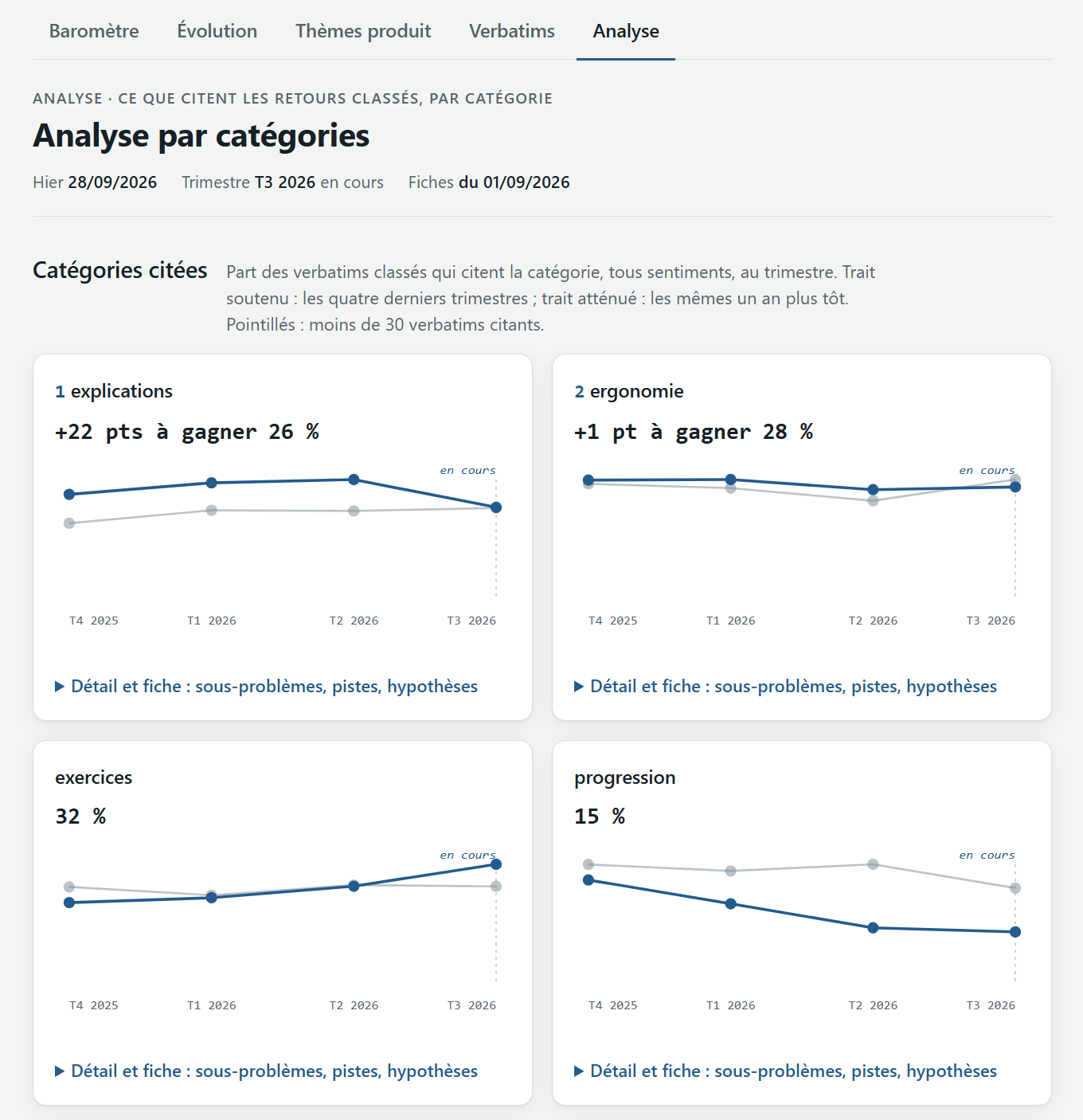
From March to September 2026, one in three pieces of feedback left in the site’s form is about the content.
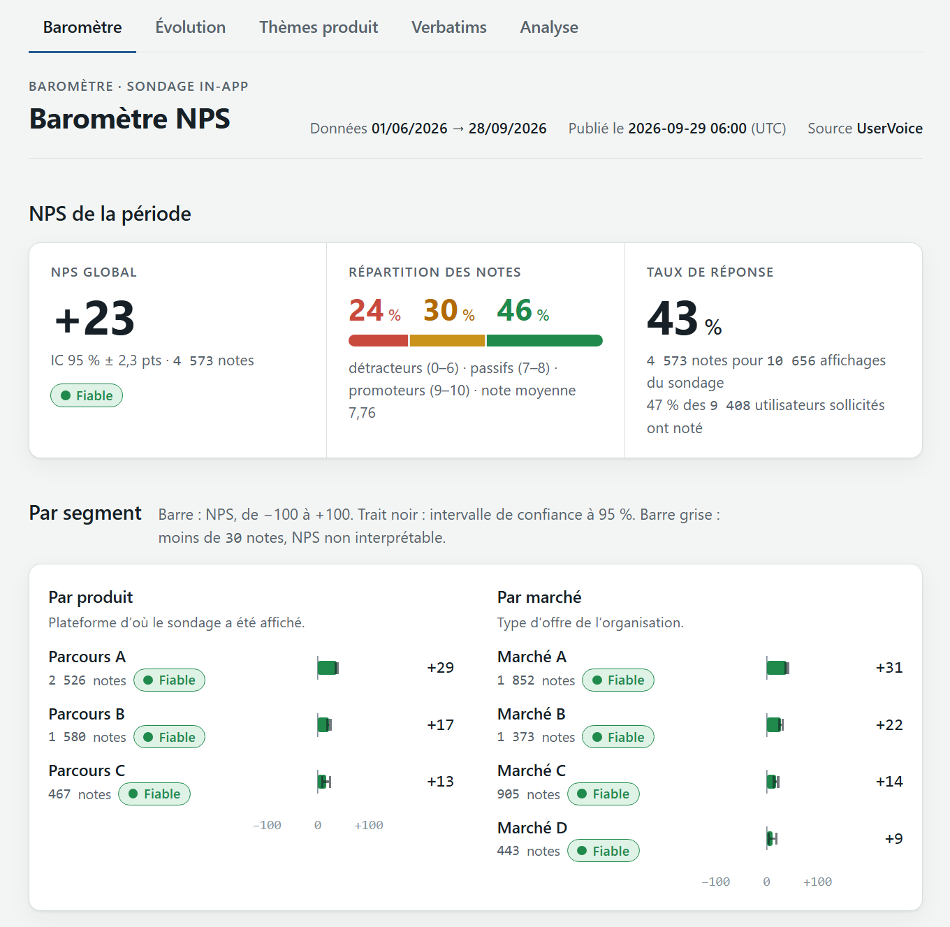
The NPS survey points the same way from another direction. Over two months in summer 2026, nearly one comment in five concerns content quality (explanations, exercise quality, translations), and half of those comments are criticisms or requests.
Bugs are still tracked, signature by signature. But satisfaction depends first on the quality of the content and its explanations, so that is where there is the most to gain.
What I built
I ran UserVoice on my own, using Claude Code to write the code.
AI classifies each piece of feedback and attaches a confidence score. Below a threshold, or when two answers are too close, the feedback goes to a human review queue. Each review adds to the examples given to the AI for the next runs, and mechanical rules take over on cases that have become obvious, such as empty answers or duplicates. The human review queue shrank by 87% in three days.
On top of the table, the dashboard has two layers: one shows what is changing, the other offers an explanation. The Monday summary sets the volume of each topic against its handling status. That is what answers the opening question.
Every decision is logged in a register, and the code is checked by tests. Anyone who revisits a threshold can see why it was set.
The data pointed to the content, and the second project in this portfolio, the content audit, starts from that finding.
Going further
What I set aside
- Double human categorization. Only the signature is entered by a person; the rest is derived from the dated data.
- Any writing to the source. We read it and never change it.
- A report organized around statistical variations. It did not show whether a topic was being handled.
The pitfalls we paid for
- Very long identifiers, which spreadsheets corrupted by turning them into scientific notation.
- Decimal commas in one of the sources.
- A dashboard that stopped updating without anyone noticing.